Jobs Online special feature: Beveridge curve in New Zealand
Published: 18 Aug 2015The Beveridge curve shows changes in matching between the demand for and supply of labour and reflects the business cycle.
Type
File
PDF, 74KB, 3 pages
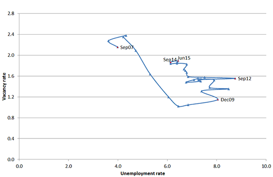
The Beveridge curve shows changes in matching between the demand for and supply of labour and reflects the business cycle. The time line shows the time series in sequence, starting with September 2007 and finishing with June 2015.
The supply of labour is represented by the unemployment rate (people who were unemployed and actively seeking work) and the demand for labour is represented by the vacancy rate. The vacancy rate is calculated by dividing the internet vacancies by employment. The unemployment rate is the ratio of unemployment levels to the labour force. The vacancies are from Jobs Online, while employment and unemployment are from the Household Labour Force Survey (HLFS).
When the economy is expanding the vacancy rate is high. This usually corresponds with a lower unemployment rate, with the underlying implication that vacancies provide opportunities for those who are unemployed to gain employment. Conversely, when the labour market is contracting the vacancy rate is low. This usually corresponds with a higher unemployment rate. An upward shift can indicate a reduction in matching efficiency (the degree to which the skills of the unemployed match the requirements of the available jobs), as it implies that the unemployment rate does not fall with higher vacancy rates. The national and regional curves tend to shift to the right following a recession, due to uncertainties in the economy after the recession.
Since December 2009, there may have also been a gain in the market share of internet vacancy advertising, both nationally and particularly in Canterbury. Auckland and Wellington appear to have the most mature internet vacancy markets, with vacancy rates of around 2.4 leading into the recession in New Zealand in 2008 and 2009. In contrast, the national vacancy rate in this period was around 1.4. This may mean that the movement of the Beveridge curve to the right represents some degree of catch-up in the rest of the country rather than a structural change in matching efficiency.
Seasonally adjusted, Sep 2007 - Jun 2015
The data table for this figure is at the bottom of this page
The national curve showed a consistent shift upwards following December 2009. The Beveridge curve showed a contraction in the labour market between September 2007 and December 2009, followed by an expansion between December 2009 and June 2015. This curve is currently near the top of the cycle, and appears to have flattened over the last few quarters. It is too early to say that this is a turning point in the labour market. The upward shift was at the bottom of the original downward sloping Beveridge curve and was in December 2009, when the unemployment rate was over 7 percent[1]. Since then the unemployment rate has fallen below 6 percent while vacancy rates doubled from about 0.8 to almost 1.6. Because the unemployment rate has not fallen as quickly as the vacancy rate has risen, there has been a shift upwards in the Beveridge curve. This could be due to less efficiency in matching.
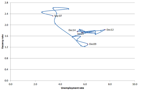
Relative to the other regions, there is a smaller shift to the right in Auckland. The Auckland curve is quite similar to the national curve but the vacancy rate has not risen to the pre-GFC levels (2.4) yet and the unemployment rate is also still about 2 percentage points higher than where it was pre-GFC.
Seasonally adjusted, Sep 2007 - Jun 2015
The data table for this figure is at the bottom of this page
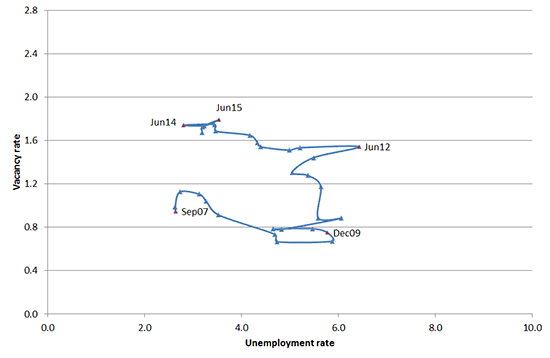
Between June 2009 and June 2011 the vacancy rate rose by 0.4 percentage points, from 1.3 to 1.7, whereas there was no change between June 2011 and June 2015. The growth in vacancies was subdued, compared to Auckland and Canterbury. In addition, there was no change in the unemployment rate between June 2009 and 2011, followed by a rise of 0.1 percentage points from 5.7 per cent in June 2011 to 5.8 per cent in June 2015. The unemployment rate in Wellington peaked at 7.6 per cent in December 2012.
Seasonally adjusted, Sep 2007 - Jun 2015
The data table for this figure is at the bottom of this page
There was a large upward shift for Canterbury since about 2011, suggesting higher vacancy rates for similar or lower unemployment rates. Following the earthquakes in 2011, the newspaper building of Christchurch Press was rendered unusable[2] and on-line vacancy listing became the only or main avenue of advertising. In addition, there has been increased construction activity in Canterbury. This shift is therefore a mix of matching inefficiency and a gain in market share for internet advertising of job vacancies. The Canterbury vacancy rate is now closer to where the national vacancy rate lies.
Seasonally adjusted, Sep 2007 - Jun 2015
The data table for this figure is at the bottom of this page
Footnotes
[1] http://www.treasury.govt.nz/economy/overview/2015/nzefo-15.pdf(external link)
[2] http://www.stuff.co.nz/the-press/news/christchurch-earthquake-2011/11241748/Christchurch-Then-and-now(external link)
Data table for Figure 1: National Beveridge curve
Data table for Figure 2: Auckland Beveridge curve
Data table for Figure 3: Wellington Beveridge curve
Data table for Figure 4: Canterbury Beveridge curve
The Beveridge curve shows changes in matching between the demand for and supply of labour and reflects the business cycle.
PDF, 74KB, 3 pages
© Ministry of Business, Innovation and Employment
https://www.mbie.govt.nz/business-and-employment/employment-and-skills/labour-market-reports-data-and-analysis/jobs-online/special-feature-beveridge-curve-in-new-zealand/
Please note: This content will change over time and can go out of date.